03__HomePage--Mobile
Heya!
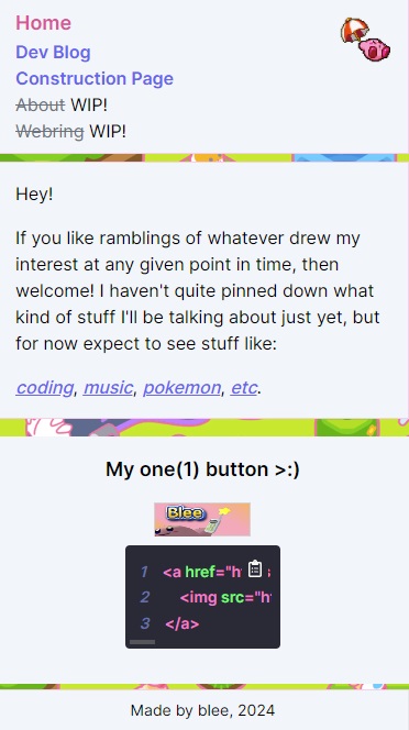
Today's blog is less about technical stuff and more about structure and design. Today...We start actually working on our site's layout! (Also yes I tend to use BEM as my naming convention for these entries idk it's a comfort thing)

Justification
As you can tell, I'm NOT a designer. But overall I think it tells the basic story I want! (Also yes this isn't the actual way to use 60/30/10 I'm not selling a product and thus don't need a CTA with the 10% so we get kirby background) I'm doing Mobile-first design, which is what tailwind wants done by default, and I'm nothing if not a surrenderer to the narrative (also it's generally easier to modularly add complexity than it is to remove it via media queries). That being said, When it comes to design, I have to maske a desktop version first (Which exists, but i'll post that file on a separate post) cause I otherwise can't get a vision of what I want the site to look like.
Basically,
Design
Desktop => Mobile
Coding
Mobile => Desktop
Now that we have that out of the way, this is once again a show of how React makes our code a lot easier to look at:
export default function Home() {
  return (
    <main
      className=" flex min-h-[100vh] flex-col items-center gap-4
                  bg-slate-400 bg-home-page bg-cover bg-no-repeat"
    >
      <Navbar />
      <Preamble />
      <ButtonContainer />
      <ChatBox />
      <Footer />
    </main>
  );
}
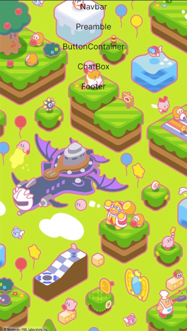
Here we can see each section encapsulated in one Component, which is pretty sweet ngl! Currently, all we have codewise in each component is boilerplate:
const Footer = () => {
  return <footer>Footer</footer>;
};

export default Footer;
But now this means that we can see that each component gets rendered as expected on our website itself:

Feature Implementation
So now, we can very easily work on each component independently, and make sure that our setup works perfectly on mobile. We can also work on the macro layout but I'll work on that later. WIP!
Update:

Mobile very basic layout updated!